Microsoft
UX design for The Max Foundation
UX Design
Overview /
Our team of designers, engineers, and program managers redesigned an app for The Max Foundation. The app is used for physicians in countries that need to secure drug treatments for their patients through The Max Foundation.
Customer
The Max Foundation. Hackathon at Microsoft.
Stakeholders
Designers, engineers, and program managers at Microsoft
Goals /
We began by meeting with our customer, The Max Foundation, where our team decided on three main goals:
Review existing flow, design, and features of the app
Assess improvements that can be made to make the app more intuitive
Uncover pain points
Existing Flow /
The Max Foundation developed a cloud-based program management software, the Patient Access Tracking System (PATS). This app allows for off-line data capture and auto-sync to support physicians in low-resource settings where internet connection is limited. The goal of the app is to deliver medication, technology, and services to patients fighting cancer and other critical illnesses in low and middle income countries around the world (at no cost to the patient). Due to lean development team and limited front-end and UX expertise, The Max Foundation needs help with the existing functionality and layout of their mobile app.
Target Persona /
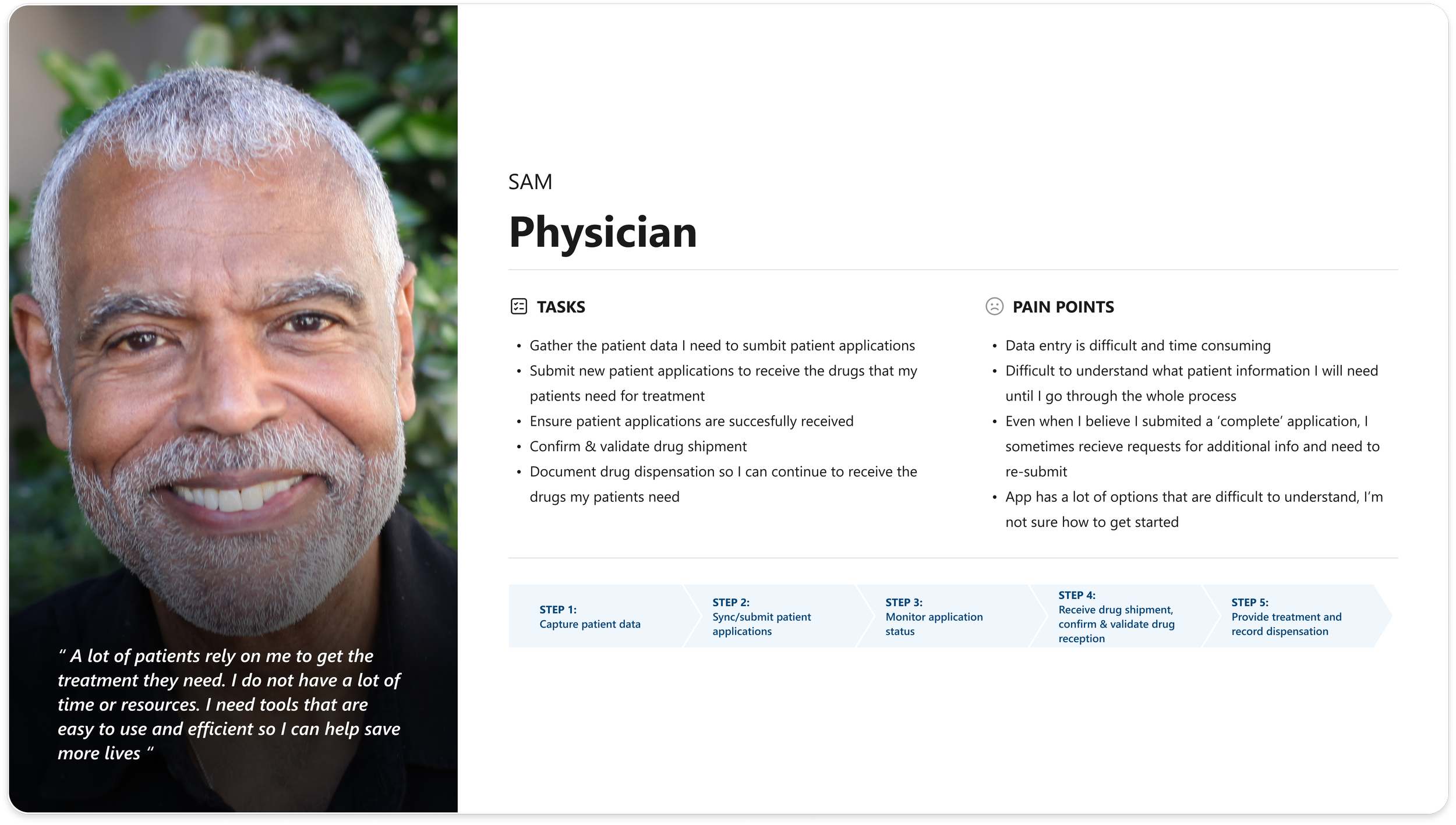
Our goal is to support The Max Foundation physicians secure drug treatments in settings where internet connection is unreliable. The app allows physicians to track each patient’s treatment life cycle including any changes that may arise.
Core Tasks /
During the hackathon I worked with team members who focused on addressing pain points surrounding patient application —
Patient Application
Submit new patient application
Draft
Completed
Drug Shipments
Shipped
Delivered
Update Patient Data
Upload data
My patients
The Process + Pain Points Discovered /
After meeting with The Max Foundation and hearing about the existing app it became clear that our team could address two key pain points —
Data entry is time consuming and difficult
Physicians usually do not have all the information needed to submit and application
There is no way to understand what information is needed up front
Physicians can submit incomplete applications
The app interface is not intuitive enough
There is overlapping information
There are no clear instructions
Addressing User Pain Points /
Dashboard: How can we simplify ‘Main Dashboard’ so that users can focus on the most important tasks?
Ideas to explore —
Group tasks that have common themes to reduce cognitive load on the dashboard
Identify sub tasks and consider adding them to a task bar for simplified navigation
Review content
New Patient Flow: How can we reduce the cognitive load of data capture?
Ideas to explore —
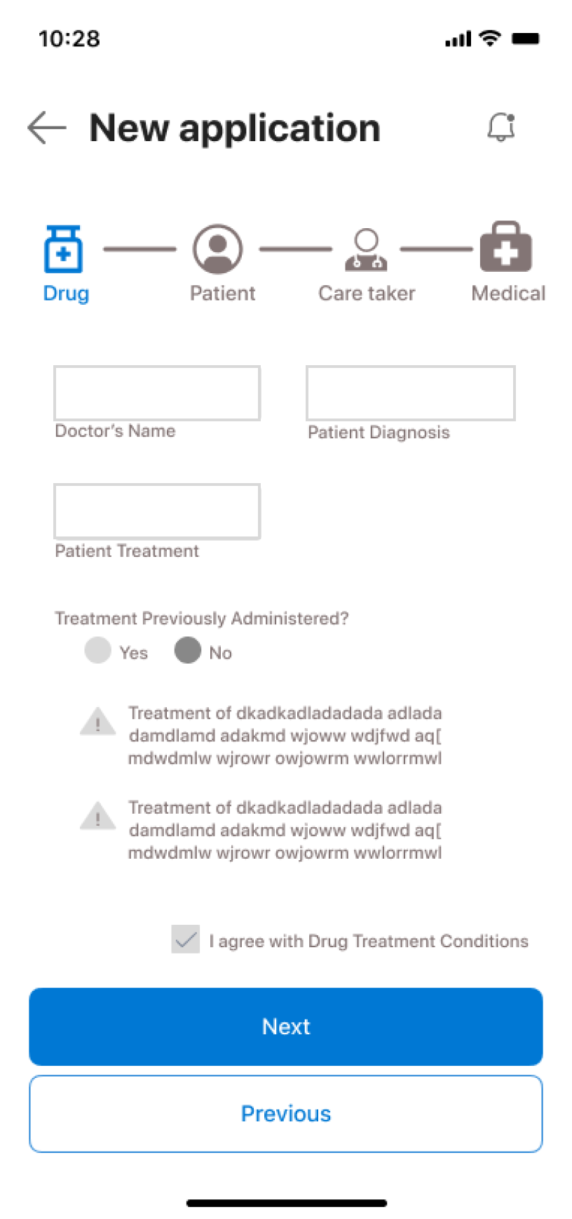
Provide visibility into progress and type of info that will be required (progress bar)
Simplify forms be removing unnecessary fields
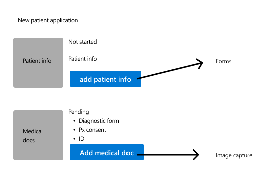
Explore how to allow physicians to capture and save the data they have (draft application)
Explore how to communicate what is missing from the application
Explore how to communicate application state and progress toward completion
Design Development /
Our team examined the existing flow and created an enhanced patient application in a variety of ways —
The information needed for physicians to complete an application is clear
The forms are more succinct
There are intuitive features on the app
The dashboard is pared down to core tasks.
Pending and completed applications added for clarity.
Application task bar included.
Clear application information.
Care taker data filled out only if needed - reduces overlapping information.
Clear application information.
Patient application submitted with clear guidelines for next steps.
Usability Testing /
Our team met with The Max Foundation to review the updated patient application flow we created. From these meetings it became clear that physicians want the guarantee that their data is synced even when the network is offline. In order to alleviate this concern we added a “Pull to re-load” feature in order for physicians to feel synced to the platform, even when wifi connection is unavailable.
What’s Next /
Our team was able to provide The Max Foundation with a framework for development in a short amount of time. The next step would be to hear from physicians about these improvements.
Project Takeaways /
It was amazing to work with other hackathon participants from around the company. Together we were able to hear from our customer and create something meaningful in a short amount of time. Together we uncovered pain points, worked in Figma, left comments for one another and had a great experience overall.


